Check out our new look! Xenia is refreshing its branding to align it with our current mission, vision, and values.

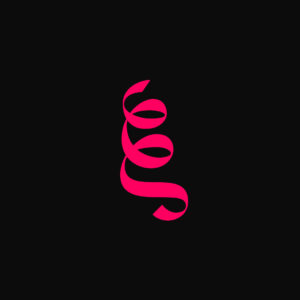
[ID: A bright pink ribbon-like emblem that resembles the Greek lowercase letter “xi,” with the words “xenia concerts” to the right, written in lowercase black slab serif font. The two words are stacked vertically.]
Why change?
- It improves accessibility. The new branding materials are accessible for people with low vision and reading-related disabilities. Colour contrast, font choice, font size, and the way visual information is presented all affect the accessibility of our materials. We want as many people as possible to be able to access our materials!
- Xenia Concerts is evolving. Xenia’s Mission and Vision have evolved in recent years, and our strategic plan involves new activities that are better represented by this new brand identity. It’s an ongoing process.
What does the brand identity represent?
The new Xenia emblem is a stylized version of the Greek letter “xi,” the first letter in the word “Xenia.” The ancient Greek practice of “Xenia” involves welcoming new people into your home and your community, and celebrating their arrival. By paying tribute to the concept of Xenia, we are celebrating the joy of inclusion and paying homage to the founding principles of our organization. We hope you love our new look as much as we do!
Special thanks to Parth Shah (@typechronicles) for his amazing accessibility-focused design work. Thank you, Parth!
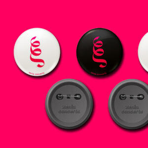
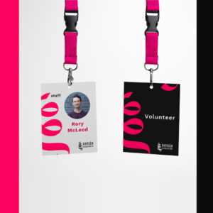
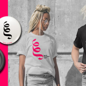
What does the new logo make you think of? A ribbon? A dance move? A musical gesture? Let us know! When you see materials like the mock-up images below, you’ll know that’s us.

